
切版乃是一大學問,HTML不會包,包出來怎麼會這樣?一縮放就爆炸,摔鍵盤了。
outline
這個通常是我拿來 Debug 使用的切版方式,記得不使用時刪除。
* {
    outline: 1px red solid;
}
box-sizing
這邊建議改成 border-box 為寬度計算會比較好計算
- content-box - (預設) 寬度以內文寬為主 (width + padding)
- border-box - 以 border 寬度內都為寬度 (width + padding + border)
display
預設HTML標籤本身幾乎都有dispaly屬性的,可以用這個方式將其樣式改變
常用:
- none - 隱藏
- inline - 區塊類型相似
<span>,任何高度/寬度都無法生效。 - inline-block - 區塊類型相似
<span>,但是可以設定 高度/寬度。 - block - 區塊類型相似
<p>,預設會佔據整行寬度與內容物高度。 - table - 區塊類型相似
<table>,可以用在 NavBar 中。 - flex - flex 屬性擴充
- grid - grid 屬性擴充
float
- float: left - 區塊排序由左向右,視窗縮放依序掉落
- float: right - 區塊排序由右向左,視窗縮放依序掉落
<head>
    <style>
        img {
            float: left;
        }
        .clear {
            clear: both
        }
    </style>
</head>
<body>
    <!-- 同層 -->
    <img src="[w3css.gif](https://upload.wikimedia.org/wikipedia/commons/5/56/Amazing_image_of_the_Earth._Original_from_NASA._Digitally_enhanced_by_rawpixel._%2829025851948%29.jpg)" width="100" height="132">
    <p>這是一段文字</p>
    <p class="clear">這是一段文字</p> <!-- 可以嘗試將 clear class 刪除-->
    <p>這是一段文字</p>

    <!-- 不同層 -->
    <div>
        <img src="[w3css.gif](https://upload.wikimedia.org/wikipedia/commons/5/56/Amazing_image_of_the_Earth._Original_from_NASA._Digitally_enhanced_by_rawpixel._%2829025851948%29.jpg)" width="100" height="132">
        <p>這是一段文字</p>
    </div>
    <p>這是一段文字</p>
    <p>這是一段文字</p>
    <!-- 但是有相同的效果,主要是分層的問題,我一率建議記得加上 clear 屬性
    因為從 class 名稱中難以看出 是否有使用 clear -->
    <!-- 如果要看出什麼是同層,可以加上 outline 屬性-->
</body>
position
定位功能,主要有這幾種
- static - 預設
- relative - 相對
- absolute - 絕對
- fixed - 釘選
<!DOCTYPE html>
<html>

<head>
    <style>
        .parent {
            width: 300px;
            height: 100px;
        }

        #parent1 {
            position: static;
            border: 1px solid blue;
        }

        #child1 {
            position: absolute;
            border: 1px solid red;
            top: 70px;
            right: 15px;
        }

        #parent2 {
            position: relative;
            border: 1px solid blue;
        }

        #child2 {
            position: absolute;
            border: 1px solid red;
            top: 70px;
            right: 15px;
        }

        #parent3 {
            position: absolute;
            border: 1px solid blue;
            top: 750px;
            right: 15px;
        }

        #child3 {
            position: absolute;
            border: 1px solid red;
            top: 70px;
            right: 15px;
        }

        #parent4 {
            position: fixed;
            border: 1px solid blue;
            background-color: rgba(255, 200, 200, 0.5);
            bottom: 0;
            left: 0;
            right: 0;
        }

        #child4 {
            position: absolute;
            border: 1px solid red;
            top: 70px;
            right: 15px;
        }
    </style>
</head>

<body>

    <h1>The position property</h1>

    <h2>1. position: static;</h2>
    <p>描述: 父層為預設,子層為絕對,因為父層無相對約束,變成更外層約束</p>
    <div id="parent1" class="parent">Parent1: static.
        <div id="child1">Child1: absolute</div>
    </div>

    <h2>2. position: relative;</h2>
    <p>描述: 父層為相對,子層為絕對</p>
    <div id="parent2" class="parent">Parent2: elative.
        <div id="child2">Child2: absolute</div>
    </div>

    <h2>3. position: absolute;</h2>
    <p>描述: 父層為絕對,子層為絕對,因為皆無相對約束,變成更外層約束</p>
    <div id="parent3" class="parent">Parent3: absolute
        <div id="child3">Child3: absolute</div>
    </div>

    <h2>4. position: fixed;</h2>
    <p>描述: 父層為釘選,子層為絕對</p>
    <div id="parent4" class="parent">Parent4: fixed
        <div id="child4">Child4: absolute</div>
    </div>

</body>

</html>
flex
這算是現代RWD必備技能了,這項武器。
<head>
    <style>
        .flex {
            display: flex; /* 宣告此區塊內為Flex屬性,區塊內排序由此父層先定義排序方式 */
        }
    </style>
</head>
<body>
    <div class="flex">
        <div class="item">one</div>
        <div class="item">two</div>
        <div class="item">three</div>
    </div>
</body>
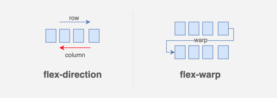
flex-direction
.flex {
    flex-direction: row | row-reverse | column | column-reverse;
                    /* 左至右 | 右至左 | 上至下 | 下至上 */
}
flex-wrap
.flex {
    flex-wrap: wrap | nowrap | wrap-reverse;
            /* 會換行,開頭一樣順勢掉落 | 預設 | 相反換行,開頭一樣逆勢掉落 */
}
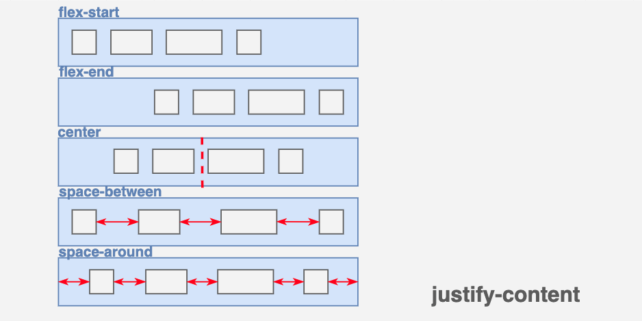
justify-content
.flex {
    justify-content: flex-start | flex-end | center | space-between | space-around;
}

align-items
.flex {
    align-items: flex-start | flex-end | center | baseline | stretch;
}

align-content
.flex {
    align-content: flex-start | flex-end | center | space-between | space-around | stretch;
}
flex 學習資源
grid
Grid進化版排版,這武器若遇上特製版面,建議使用 Grid 排列
注意事項:
- 中文遇到寬度超過會自動換行,英文不會因為英文字母 若是連在一起會視為同一個文字,這樣的話要設定
word-wrap這個 css 屬性。 - 只會影響子層區塊排列大小,子層也可以再設定
display: grid
<head>
    <style>
        .wrapper {
            display: grid; /* 宣告此區塊內為grid屬性 */
        }
    </style>
</head>
<body>
    <div class="wrapper">
        <div class="item">one</div>
        <div class="item">two</div>
        <div class="item">three</div>
    </div>
</body>

fr
fr 是新的一種單位計算用來 Grid,非常好用,假設有 3 個 column 的大小 就是 3fr
grid-template-columns
.wrapper {
    grid-template-columns: repeat(6, 1fr); /* 6個 區塊 */
    /* grid-template-columns: 1fr 20% 200px;     3個 區塊,可以用傳統自定義的寬度去比 */
}
grid-auto-rows
.wrapper {
    grid-auto-rows: minmax(100px, auto); /* 最小/最大 的 row 高度 */
}
grid-gap
.wrapper {
    grid-gap: 10px 10px; /* 縱軸 橫軸 column 之間的寬度 */
}
grid-column
.item {
    grid-column: 1 / 4; /* 橫軸 Grid Line 佔幾格,算客自參數 */
}
grid-row
.item {
    grid-row: 2 / 4; /* 縱軸 Grid Line 佔幾格,算客自參數 */
}
grid 學習資源
@media
@media <裝置> {
    ... 撰寫
}
最常使用的寫法
@media screen (max-width:414px){
     ...
}